Parents researching childcare don’t browse the way you might expect. They’re rarely sitting down for a leisurely look; they’re checking your website on their phone during a lunch break, in the few quiet minutes after putting a toddler to bed, or while juggling a conversation with their partner about whether you’re “the one.” They’re comparing you to two or three other settings open in different tabs, and they’re making snap judgements fast.
Understanding what they’re actually looking for, rather than what we assume looks impressive, makes the difference between a website that generates enquiries and one that just sits there looking good. Here’s what consistently matters most, drawn from years of building nursery and Montessori websites across the UK.
Reassurance Comes Before Inspiration
Before a parent falls in love with your “ethos” or your beautiful outdoor space, they need to feel safe. This sounds obvious, but it’s the single most underserved need on most nursery websites we audit. Parents are handing over their most precious responsibility to strangers, and underneath every other question is one unspoken one: will my child be safe here?
That means your Ofsted rating needs to be visible, not buried three clicks deep. Policies, especially safeguarding policies, should be easy to find, not hidden in a footer link nobody clicks. Staff qualifications, staff ratios and DBS checks, even mentioned briefly, send a quiet but powerful signal. None of this needs to dominate your homepage, but it needs to be findable within seconds, because a parent who can’t find it will assume the worst and move to the next tab.
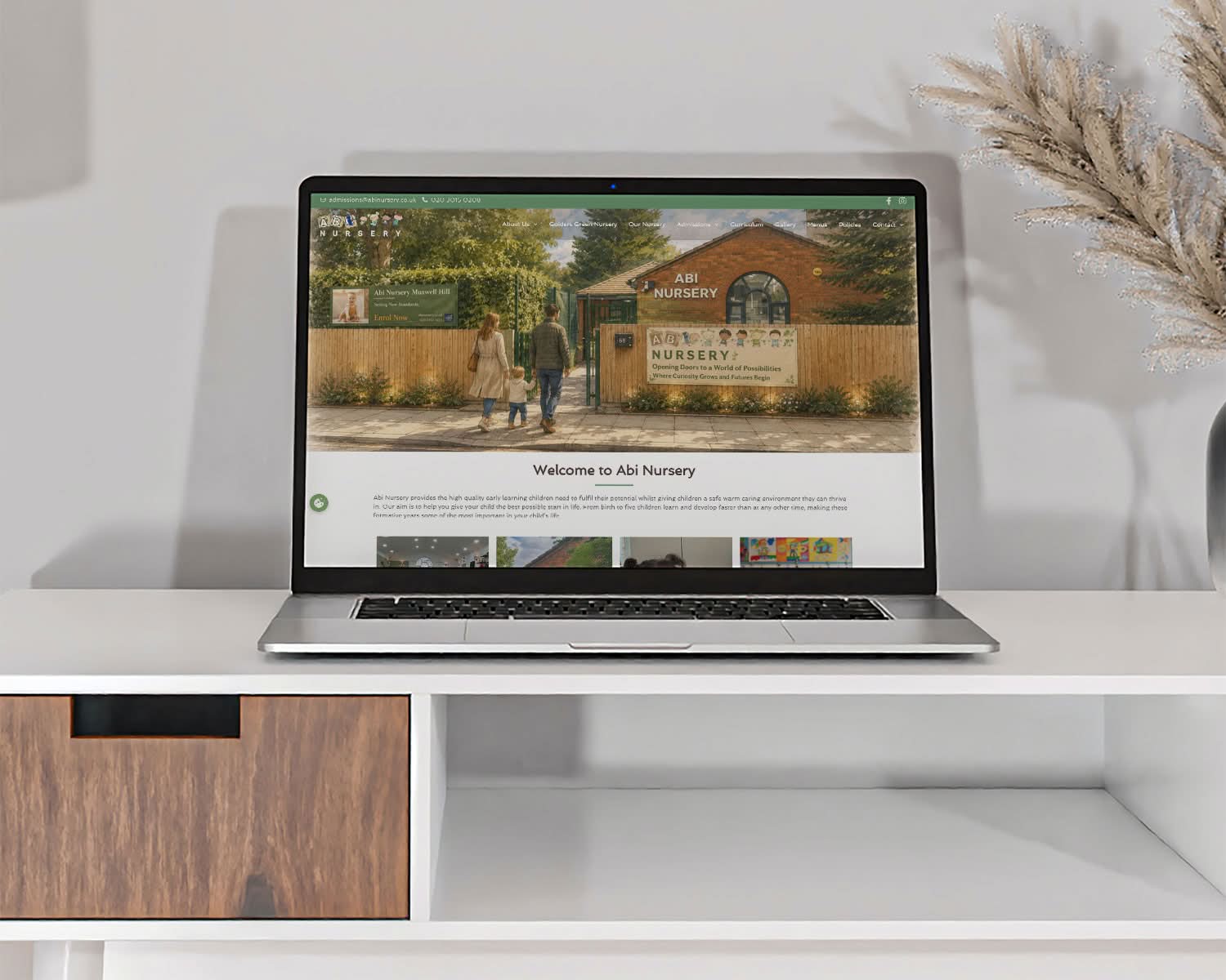
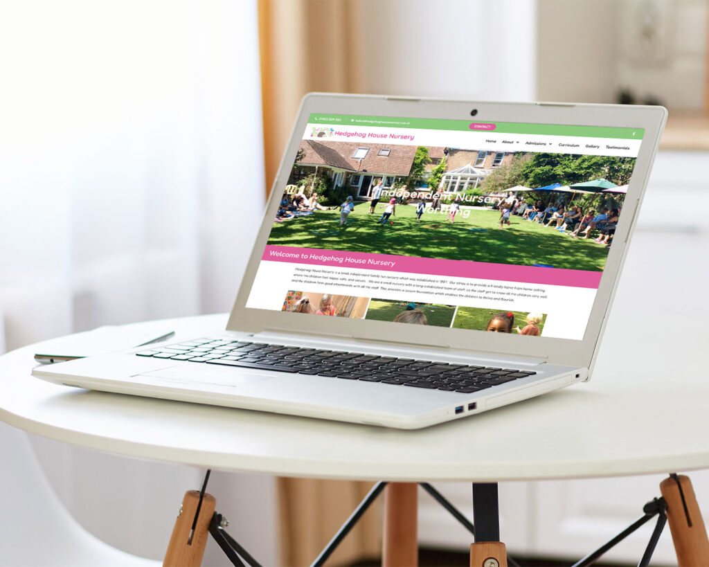
Real Photos, Not Stock Photos
Parents can spot a stock photo instantly, and it does real damage to trust. A website full of generic, suspiciously perfect children doesn’t reassure anyone – it raises the question of what you’re hiding. The settings that convert best use real photography of their actual rooms, actual staff, and (with appropriate consent) actual children at play. Obviously, if you are just starting up and haven’t got photography yet, that’s fine, but use CGI room visualisations and explain. A small disclaimer saying “we are working on our photography as our nursery opens” can make a real difference.
For Montessori settings specifically, this matters even more. Parents drawn to the Montessori approach are often researching it carefully, sometimes more carefully than parents choosing a conventional nursery, because they’ve actively sought out an alternative philosophy. They want to see the real Montessori materials, the real practical-life area, the real calm, ordered environment, not a generic “happy children playing” stock shot that could belong to any nursery anywhere. If your photography doesn’t reflect your actual classroom, you’re undermining the very thing that made a Montessori-seeking parent choose you over a conventional setting in the first place.
The “Ethos” Has to Feel Real, Not Copy-Pasted
Every nursery website says some version of “we provide a nurturing environment where children can thrive.” Parents have read this sentence a hundred times across a hundred websites, and it has stopped meaning anything. What actually lands is specificity: what does a typical morning look like in your setting? What’s an example of how your key person approach plays out in practice? What’s one thing a parent would notice in their first five minutes through the door?
This is where Montessori and other named-philosophy settings have a genuine advantage, if they use it. Rather than vague reassurance, you can describe an actual Montessori activity, explain why children work with real glass and ceramics rather than plastic, or describe how mixed-age classrooms work in practice. Specificity reads as confidence. Vagueness reads as filler.
Practical Information, Fast
Once trust is established, parents move quickly to logistics, and they want answers without having to email or call. The information they’re hunting for, roughly in order, is: do you have space for my child’s age group, what are your hours, what does it cost (or at least a realistic indication), where exactly are you located and what’s parking like, and what’s your waiting list situation.
Burying fees behind a “contact us for pricing” wall is one of the most common frustrations parents raise, even when the eventual answer is reasonable. We understand the instinct as fees vary by funding, hours and age, but a clear starting-from price, or a simple table of typical session costs, does far more to build trust than no information at all. Parents read total opacity as something to be wary of, even when there’s a perfectly innocent reason behind it.
A Way to Take the Next Step Without Picking Up the Phone
Not every parent wants to make a phone call as their first point of contact, particularly if they’re researching late at night or comparing several settings before they’ve committed to anything. A simple enquiry form, a clear “book a visit” option, and a waiting list signup that doesn’t require an account or a lengthy process all reduce the friction between “I like this” and “I’ve taken action.” If you have the staff capacity to manage it, we really recommend a chat facility like WhatsApp or Facebook Messenger.
This matters just as much for retention of existing parents as it does for attracting new ones. A password-protected parent area for newsletters, menus and policy documents saves your staff time answering routine queries, and it signals to prospective parents that you run things in an organised, modern way.
Consistency Between What’s Said and What’s Shown
The single fastest way to lose a parent’s trust is a mismatch between your written copy and your visuals. If your text talks about a calm, ordered Montessori environment but your photos show clutter and chaos, parents notice the contradiction immediately, even subconsciously. The same applies to a conventional nursery claiming to be a vibrant, stimulating setting, while the photography looks flat and under-lit.
Whatever your actual ethos is, your website’s words, images, and even colour palette should all point in the same direction. This is part of why bespoke design matters more in this sector than in most others — a templated site applied uniformly across very different settings often ends up saying one thing while showing another.
What This Means for Your Website
None of this requires a complex rebuild. It usually means auditing what you’ve already got against these priorities: is your Ofsted information genuinely easy to find, are your photos real and recent, does your ethos copy say something specific rather than generic, can a parent find fees and availability without contacting you, and is there a low-friction way to take the next step.
If you’re reviewing your own setting’s website against this list and finding gaps, that’s a normal place to start from. Most nursery websites we look at have at least two or three of these missing. We specialise in nursery and Montessori website design precisely because getting this right takes specific industry knowledge, not just general web design skill, and we’d be glad to take an honest look at where yours currently stands.
Related reading: How Much Does a Preschool or Nursery Website Cost in the UK?.