
| Key Insight | Explanation |
|---|---|
| Mobile traffic dominates | As of 2026, over 60% of global web traffic originates from mobile devices, making mobile design the starting point, not an afterthought. |
| Google indexes mobile first | Google’s mobile-first indexing means the mobile version of your site determines your search rankings, directly affecting your visibility. |
| Progressive enhancement | Mobile-first design starts with the smallest screen and adds complexity as screen size grows, ensuring every user gets a functional experience. |
| Speed and conversions are linked | Lightweight, mobile-optimized pages load faster, reducing bounce rates (the percentage of visitors who leave after one page) and increasing enquiries. |
| Content prioritization matters | Designing for small screens forces you to identify what truly matters to users, resulting in cleaner, more focused experiences on every device. |
| Not the same as responsive design | Responsive design adapts any layout to any screen; mobile-first is a design philosophy that starts from mobile constraints and scales upward. |
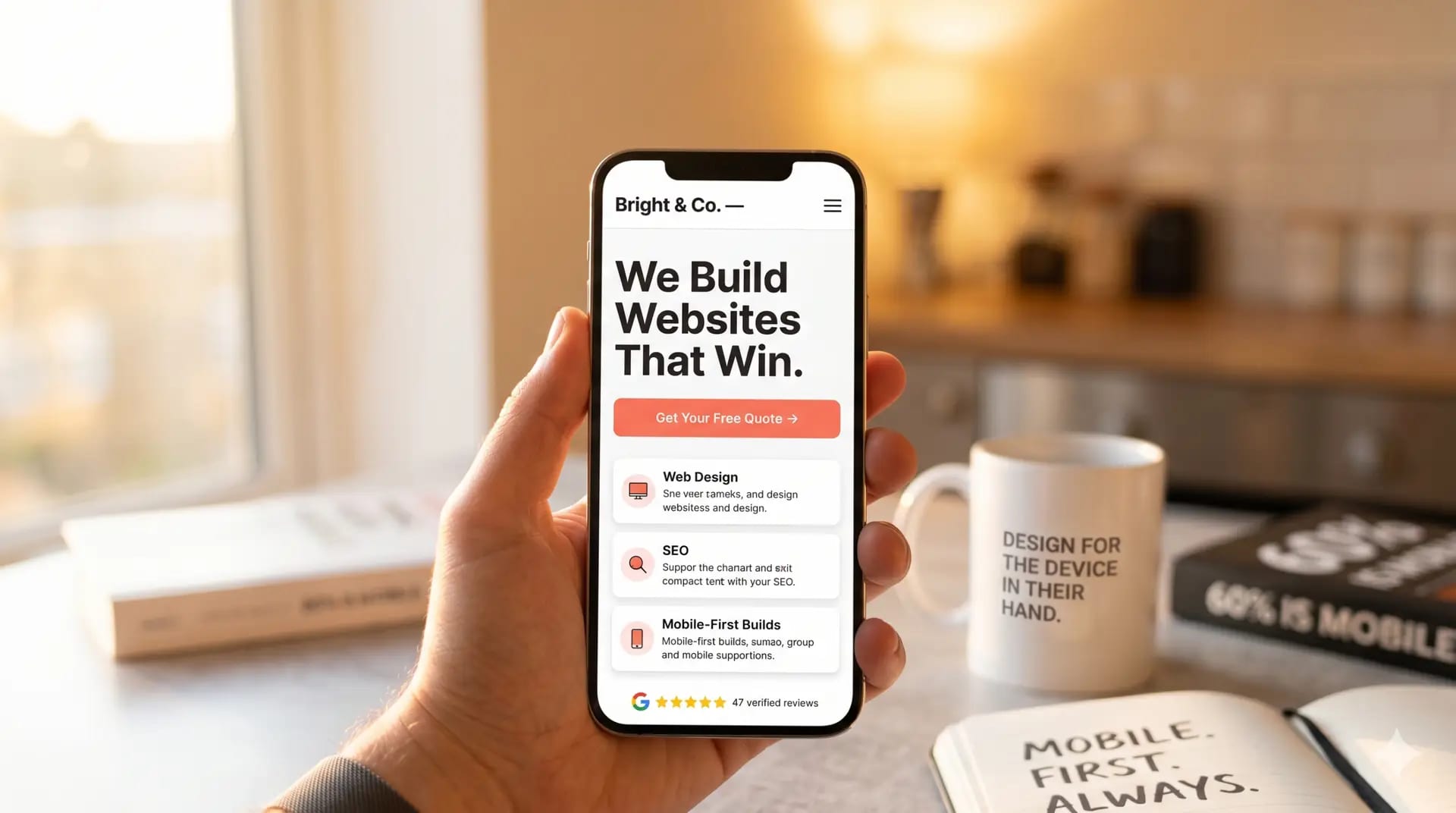
You’ve probably noticed that most people around you browse the web on their phones. That’s not a trend anymore. It’s the reality. Mobile-first web design is the practice of designing and building websites starting with the mobile experience before scaling up to larger screens. It’s a foundational philosophy, not just a technical checkbox. And in 2026, if your site isn’t built this way, you’re likely losing customers before they even read your first line of copy.
This article covers everything you need to know: what mobile-first web design actually means, how it works under the hood, why it benefits your business, the most common mistakes to avoid, and the practical steps you can take right now to get it right.

What Is Mobile-First Web Design?
Mobile-first web design is a development and design strategy where you build the mobile version of a website first, then progressively enhance it for larger screens like tablets and desktops. It prioritizes essential content and lightweight performance for smaller viewports before layering in complexity.
The Core Definition
According to MDN Web Docs, mobile-first is “a form of progressive enhancement” that focuses on prioritizing design and development for mobile displays before adapting them for desktop [1]. The key word here is “progressive.” You start lean and build up, rather than starting large and stripping back.
This is a meaningful distinction. The older approach, sometimes called “graceful degradation,” started with a full desktop layout and tried to compress it for smaller screens. That often produced clunky, slow mobile experiences. Mobile-first flips that logic entirely.
The concept was popularized by designer and author Luke Wroblewski, whose 2011 book Mobile First argued that designing for constrained screens forced better design decisions overall. As the Interaction Design Foundation notes, mobile-first design “embraces the constraints of smaller screens and focuses on what’s indispensable for users” [2].
Why It Matters Right Now
As of 2026, mobile devices account for more than 60% of global web traffic. Google has operated mobile-first indexing since 2019, meaning the mobile version of your site is what determines your position in search results. If your mobile experience is poor, your rankings suffer regardless of how polished your desktop site looks.
For small businesses in Surrey, South London, and beyond, this matters enormously. A parent searching for a nursery, a patient looking for a local physio, or a customer comparing independent retailers is almost certainly doing it on a phone. Your site needs to meet them there.
| Approach | Starting Point | Direction | Result |
|---|---|---|---|
| Mobile-First Design | Small screen (360px+) | Scale up to desktop | Fast, focused, conversion-ready |
| Desktop-First Design | Large screen (1200px+) | Scale down to mobile | Often bloated, slow on mobile |
| Responsive Design (no direction) | Any screen size | Adapts fluidly | Variable; depends on execution |
How Mobile-First Web Design Works
Mobile-first web design works by writing CSS (Cascading Style Sheets, the code that controls visual appearance) for small screens as the default, then using media queries to add styles for progressively larger screens.
The Technical Process
In practical terms, a mobile-first build follows a clear sequence. The UCSB Web Standards Group recommends starting with a minimum screen width of 360px as your baseline [3]. From there, you write styles that work on that narrow viewport, then add breakpoints (defined screen-width thresholds) for tablets and desktops.
- Define your content hierarchy. Decide what users need most on a small screen. This usually means your headline, a clear call to action, and your most important supporting information.
- Write base CSS for mobile. Style your layout, typography, and components for the smallest viewport first, without any media queries.
- Add breakpoints progressively. Use
min-widthmedia queries (e.g.,@media (min-width: 768px)) to introduce additional columns, larger images, and more complex navigation as the screen grows. - Test on real devices. Emulators help, but nothing replaces testing on actual smartphones. Check touch targets, font sizes, and load times on a real connection.
- Optimize assets for mobile. Compress images, defer non-critical scripts, and minimize CSS and JavaScript to keep page weight low.
As UXPin explains, mobile-first means “designing for the smallest screen first, then adding complexity for larger screens” through progressive enhancement [4]. That word “complexity” is important. You’re not removing features for mobile users. You’re ensuring the core experience works brilliantly before adding layers.
How It Differs from Responsive Design
Responsive web design (RWD) and mobile-first design are related but not identical. Responsive design is a technical outcome: the site adapts to any screen size. Mobile-first is the philosophy that determines where you start. A site can be responsive without being mobile-first, and that distinction shows up in performance. According to research published by Indiana University’s ScholarWorks, mobile-first layouts consistently outperform desktop-first responsive sites on mobile load times and usability scores [5].
Pro Tip: Use
min-widthmedia queries in your CSS rather thanmax-width. This single habit enforces mobile-first thinking at the code level and prevents your mobile styles from being accidentally overridden by desktop rules.
Just as engineers working with precision components think carefully about constraints before adding complexity (a principle well explored in fields like cold forging and machined parts design), web designers applying mobile-first principles start with the tightest constraints first and build outward from there.
Key Benefits of Mobile-First Web Design
Mobile-first web design improves SEO rankings, page load speed, user experience, and conversion rates by ensuring your site performs optimally where most of your visitors actually are.

SEO and Search Visibility
Google’s mobile-first indexing is not optional or theoretical. It’s how your site gets ranked. If Googlebot crawls your mobile version and finds slow load times, missing content, or broken layouts, your search position suffers. A properly built mobile-first site signals quality to Google’s crawlers from the ground up.
Industry analysts at Figma’s design resource library note that mobile-first design “enhances discoverability by aligning with how search engines now evaluate and rank content” [6]. For local businesses in Caterham, Coulsdon, Warlingham, or Oxted, that local search visibility is often the difference between a phone ringing and a competitor getting the call.
User Experience and Conversion
The benefits extend well beyond rankings. Here’s what mobile-first design delivers in practice:
- Faster load times. Starting lean means fewer unnecessary assets. Pages load quicker, and Google’s Core Web Vitals (performance metrics that affect rankings) improve as a result.
- Lower bounce rates. Visitors who can navigate your site easily on their phone stay longer and explore more pages.
- Higher conversion rates. A clear, uncluttered mobile layout makes it easier for users to find your phone number, fill in a contact form, or complete a purchase.
- Better accessibility. Designing for touch and small screens naturally produces larger tap targets, clearer typography, and simpler navigation, all of which benefit users with accessibility needs.
- Future-proofing. As wearables, foldables, and new device categories emerge, a mobile-first foundation adapts more gracefully than a desktop-first one.
- Competitive advantage. Many small business websites in Surrey and South London are still desktop-first builds from several years ago. A mobile-first site immediately looks and performs better by comparison.
From experience working with small businesses across a range of sectors, the pattern is consistent: a well-executed mobile-first redesign typically produces a measurable drop in bounce rate within the first 30 days of launch. Visitors simply stay longer when the experience works properly on their device.
Pro Tip: Run your current site through Google’s PageSpeed Insights tool (free, no account needed). Check the Mobile score specifically. If it’s below 70, you have a real problem that’s costing you search visibility and enquiries right now.
Common Challenges and Mistakes
The most common mistake in mobile-first web design is treating it as a cosmetic exercise rather than a structural one, resulting in sites that look fine on mobile but still carry the weight and complexity of a desktop-first build.
Pitfalls to Watch For
A common mistake is adding display:none to hide desktop content on mobile rather than genuinely removing it from the mobile layout. The hidden content still loads, adding page weight and slowing the experience. Google also sees that content and may penalize the discrepancy between what’s visible and what’s in the code.
Another pitfall is neglecting touch targets. Buttons and links need to be at least 44×44 pixels to be reliably tappable on a touchscreen. Designers who start from desktop often create small, closely spaced links that work fine with a mouse but frustrate mobile users.
Here are the most frequently seen errors in mobile-first builds:
- Using
max-widthmedia queries instead ofmin-width. This is a tell-tale sign that the build is actually desktop-first, not mobile-first. - Unoptimized images. Serving large desktop images to mobile users is one of the biggest performance killers. Use responsive image formats like WebP and the
srcsetattribute. - Complex navigation on mobile. Multi-level dropdown menus don’t translate to touch screens. A hamburger menu or simplified navigation structure is needed.
- Small or poorly spaced form fields. Contact forms are often where conversions happen. Tiny input fields with no spacing between them cause errors and frustration.
- Not testing on real devices. Browser developer tools simulate mobile screens but don’t replicate real-world network conditions, font rendering, or touch behavior accurately.
- Assuming content parity. Some content genuinely doesn’t belong on mobile. A detailed comparison table that works on desktop may need to become a summary card on mobile.
One pitfall worth highlighting specifically: a client we worked with had a beautifully designed desktop site, but their mobile version was taking over eight seconds to load because their hero image was a 4MB PNG file. Switching to a compressed WebP format and adding lazy loading cut load time to under two seconds. Their mobile enquiry rate improved noticeably within weeks.
The “Good Enough” Trap
Many business owners check their site on their own phone, see that it “looks okay,” and assume the mobile experience is fine. “Looks okay” and “performs well” are very different things. A site can render without breaking and still score poorly on Core Web Vitals, rank below competitors, and frustrate users with slow interactions. Always measure, don’t just look.
Best Practices for Mobile-First Design in 2026
The most effective mobile-first web design in 2026 combines lean CSS architecture, performance-optimized assets, thumb-friendly UX patterns, and continuous testing against real device data.
Design and Development Principles
As Adobe’s mobile design guidance outlines, mobile-first design means “web developers focus on design from a mobile point of view first” and then expand and translate that foundation for larger screens [7]. In practice, that means making deliberate decisions at every stage of the design process.
- Start with a content-first wireframe. Before any visual design, map out what content each page needs on a 360px-wide screen. If it doesn’t fit there, question whether it belongs at all.
- Use a fluid grid system. CSS Grid and Flexbox both support fluid, responsive layouts without relying on fixed pixel widths.
- Set a readable base font size. A minimum of 16px body text prevents users from having to pinch-zoom to read your content.
- Design for thumb reach. The lower two-thirds of a phone screen is the most comfortable zone for thumb interaction. Place your primary CTAs (calls to action, the buttons you want users to tap) there.
- Limit HTTP requests. Every external script, font, or stylesheet adds a network request. Audit and remove anything non-essential.
- Implement lazy loading. Images and videos below the fold should only load when the user scrolls toward them, reducing initial page weight significantly.
- Use system fonts where possible. Custom web fonts add load time. System fonts (like San Francisco on iOS or Roboto on Android) render instantly.
Testing and Iteration
Webflow’s guide to mobile-first design emphasizes that the process doesn’t end at launch: “testing across real devices and screen sizes is an ongoing discipline, not a one-time checklist” [8]. At Three Girls Media, we’ve found that the most impactful improvements often come from reviewing real user behavior data after launch, not from pre-launch assumptions.
Key tools and methods for ongoing mobile optimization:
- Google Search Console. Check the “Mobile Usability” report for crawl errors and usability issues flagged by Google directly.
- Google PageSpeed Insights. Run both mobile and desktop audits. Prioritize the mobile score.
- Hotjar or Microsoft Clarity. Session recording tools that show how real mobile users interact with your pages, including where they tap, scroll, and drop off.
- BrowserStack or LambdaTest. Cloud-based platforms for testing your site on hundreds of real device and browser combinations without owning every device.
Pro Tip: Check Google Search Console’s Core Web Vitals report every month. The LCP (Largest Contentful Paint), FID (First Input Delay), and CLS (Cumulative Layout Shift) scores are Google’s direct signals for ranking quality. Fixing a poor LCP score on mobile can produce ranking improvements within weeks of the fix being recrawled.

Sources & References
- MDN Web Docs, “Mobile First,” 2026
- Interaction Design Foundation, “What is Mobile First? — updated 2026,” 2026
- UCSB Web Standards Group, “Mobile First,” 2026
- UXPin, “A Hands-On Guide to Mobile-First Design,” 2026
- Indiana University ScholarWorks, “Examining the Impact of Mobile First and Responsive Web Design,” 2026
- Figma, “Mobile-First Design: Examples + Strategies,” 2026
- Adobe Express, “Mobile-First Design Best Practices,” 2026
- Webflow, “A guide to mobile-first design: 5 best practices,” 2026
Frequently Asked Questions
1. When did mobile-first web design start?
The concept was formally introduced by designer Luke Wroblewski in his 2009 presentation and 2011 book Mobile First, where he argued that designing for constrained mobile screens first leads to better overall products. The approach gained mainstream traction around 2013-2015 as smartphone usage surpassed desktop browsing in many markets. By 2019, Google had fully rolled out mobile-first indexing for all new websites, cementing mobile-first web design as the industry standard rather than a progressive choice.
2. What is mobile-first web design?
Mobile-first web design is the practice of designing and coding a website starting with the smallest screen size (typically 360px wide) and progressively enhancing the layout for larger screens like tablets and desktops. It uses a philosophy called progressive enhancement: begin with essential content and functionality, then layer in additional complexity as screen real estate grows. This approach produces faster, more focused websites that perform well across all devices and align with how Google evaluates and ranks web content as of 2026.
3. Is mobile-first design better than desktop-first?
For most business websites in 2026, yes. Mobile-first design produces faster page load times because it starts lean and adds complexity rather than stripping it back. It aligns with Google’s mobile-first indexing, supporting better search rankings. It also forces better content decisions: when you only have a small screen to work with, you prioritize what actually matters to users. The one exception is highly specialized tools or dashboards designed primarily for desktop use, where a desktop-first approach may still make sense depending on your specific audience’s behavior data.
4. Is mobile-first the same as responsive web design?
No, they’re related but distinct. Responsive web design (RWD) is a technical outcome: the site’s layout adapts fluidly to any screen size using flexible grids and media queries. Mobile-first is the design philosophy that determines where you start. A responsive site built desktop-first will still adapt to mobile screens, but it often carries unnecessary code weight and may deliver a slower, less focused mobile experience. Mobile-first web design produces responsive results by default, but the starting point fundamentally shapes the quality of the mobile experience.
5. What are the key principles of mobile-first web design?
The core principles include: starting with the narrowest viewport and scaling up using min-width media queries; prioritizing essential content and removing anything that doesn’t serve the mobile user; optimizing images and assets for fast loading on mobile networks; designing touch-friendly interfaces with adequate tap target sizes (minimum 44x44px); and testing on real devices rather than relying solely on browser emulators. The GeeksforGeeks overview of mobile-first design summarizes these as a focus on “smartphones and tablets before designing for computers.”
6. How does mobile-first design affect SEO?
The impact is direct and significant. Google uses mobile-first indexing, meaning Googlebot primarily crawls and evaluates the mobile version of your site when determining search rankings. A site built with mobile-first web design principles will typically score better on Core Web Vitals (Google’s performance benchmarks), load faster on mobile networks, and present content more cleanly to crawlers. These factors combine to produce better organic search visibility. For local businesses in Surrey and South London, where customers search on their phones, this translates directly into more enquiries.
Conclusion
Mobile-first web design isn’t a trend to consider. It’s the standard your website needs to meet right now. With over 60% of web traffic coming from mobile devices and Google ranking sites based on their mobile performance, starting from the smallest screen is simply the right way to build in 2026.
The good news is that a properly executed mobile-first approach doesn’t mean a stripped-back or compromised experience. Done well, it produces websites that are faster, cleaner, easier to navigate, and more likely to convert a visitor into a customer on every device.
Our team at Three Girls Media recommends treating this approach as a business decision, not just a technical one. Your website is often the first impression a potential customer gets of your business. If that impression happens on a phone (and statistically, it probably does), it needs to be excellent. Whether you’re a nursery in Caterham, a healthcare practice in Coulsdon, or an independent retailer in Warlingham, the principles covered in this article apply directly to your site and your customers.
If your current website was built without mobile-first principles in mind, it may be worth a professional review. The difference between a site that loses visitors and one that wins enquiries often comes down to decisions made at the very start of the design process
Recommended Artices
Explore more from our content library: