
| Key Insight | Explanation |
|---|---|
| Mobile traffic dominates | As of 2026, over 60% of global web traffic originates from mobile devices, making a site that adapts to screen size essential for any business. |
| Three core technical pillars | Responsive design relies on fluid grids, flexible images, and CSS media queries working together to reshape layouts for any viewport. |
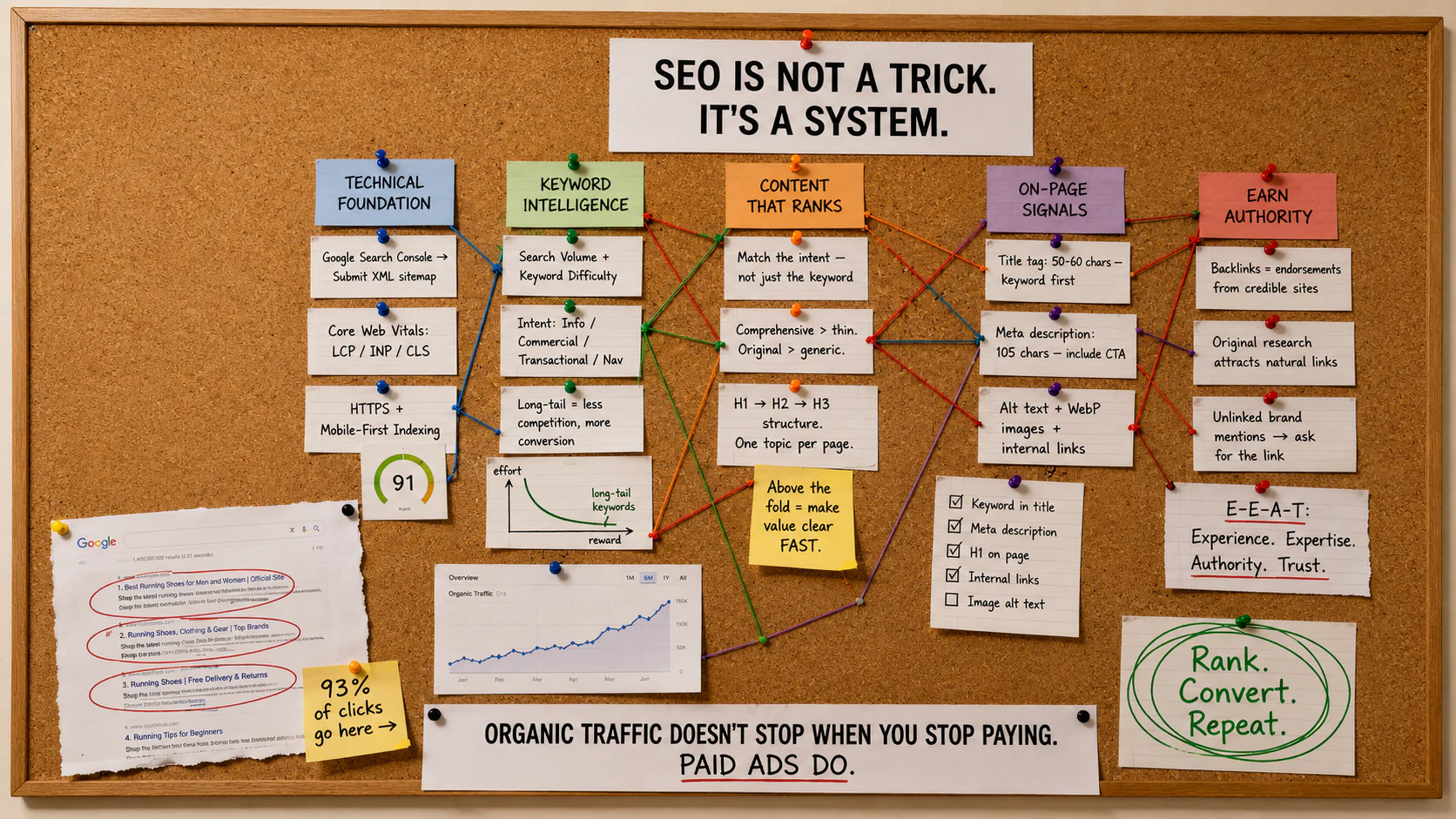
| Google rewards responsiveness | Google’s mobile-first indexing means your mobile layout is the version crawled and ranked, directly tying responsive design to search visibility. |
| One site, every device | A single responsive codebase replaces the need for separate desktop and mobile sites, reducing maintenance costs and avoiding duplicate-content penalties. |
| UX drives conversions | Poor mobile experiences cause visitors to leave immediately. A well-built responsive site keeps users engaged and more likely to contact or buy. |
| Mobile-first is the right approach | Designing for the smallest screen first and scaling up produces cleaner, faster, more focused websites than retrofitting a desktop design downward. |
You’ve probably opened a website on your phone and immediately wanted to close it. Tiny text, buttons you can’t tap, images that bleed off the screen. That frustration is exactly what responsive website design is built to prevent. Responsive website design is the practice of building a single website that automatically adjusts its layout, images, and content to display correctly on any screen size, from a 27-inch desktop monitor to a 5-inch smartphone.
This guide covers everything you need to know: how the technology works, why it matters for your search rankings and conversions, the mistakes that trip up most small businesses, and the best practices our team applies in 2026. Whether you’re planning your first website or wondering if your existing site is holding you back, you’ll leave with a clear picture of what good responsive design actually looks like.

What Is Responsive Website Design?
Responsive website design is a web development approach that makes pages render correctly on any device by using flexible layouts, scalable images, and CSS media queries to adapt to the visitor’s screen size and orientation.
The Core Definition
The term was popularised by designer Ethan Marcotte in his 2010 article for A List Apart, and it’s now the recognised standard for professional web development worldwide [1]. According to MDN Web Docs, responsive web design “is a web design approach to make web pages render well on all screen sizes and resolutions while ensuring good usability” [2].
Before responsive design existed, many businesses maintained two entirely separate websites: one for desktop visitors and one for mobile. That approach was expensive to build, painful to update, and created inconsistent brand experiences. Responsive design solved all three problems with a single, unified codebase.
Why It Matters Right Now
As of 2026, mobile devices account for more than 60% of global web traffic. Google uses mobile-first indexing, meaning it primarily crawls and ranks the mobile version of your site [3]. If your site doesn’t respond well to smaller screens, you’re not just frustrating visitors. You’re actively harming your search rankings.
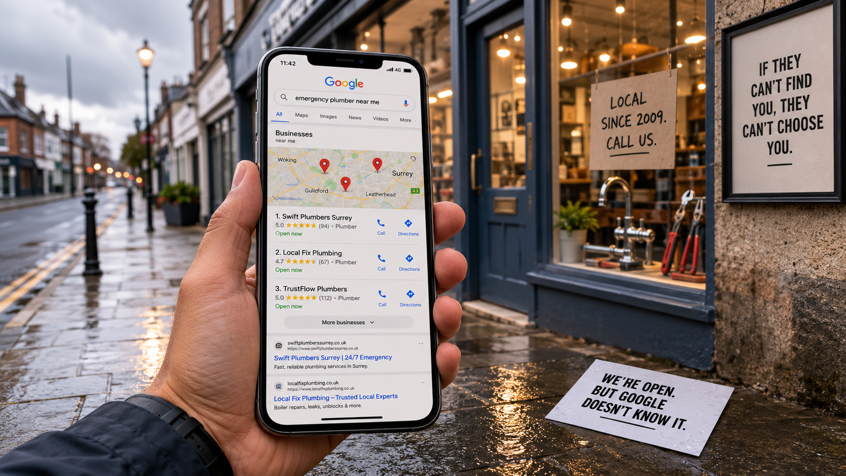
For small and medium-sized businesses in Surrey and South London, the stakes are particularly high. A potential customer searching for a local nursery, healthcare clinic, or independent retailer will almost certainly be on their phone. If your site doesn’t adapt to that screen, they’ll simply tap back and choose a competitor.
- Responsive design is now a baseline expectation, not a premium feature
- Google’s Core Web Vitals (the metrics Google uses to measure page experience) reward well-optimised responsive layouts
- A single responsive site is significantly cheaper to maintain than separate desktop and mobile versions
- Industry analysts at web.dev describe responsive design as foundational to “sites that look great and work well for everyone” [4]
How Responsive Website Design Works
Responsive website design works through three interconnected technical components: fluid grids, flexible images, and CSS media queries, which together allow a single set of HTML and CSS code to produce different layouts for different screen sizes.
The Three Technical Pillars
Understanding these pillars helps you have better conversations with your web designer and make smarter decisions about your site. As W3Schools explains, responsive design is “about using HTML and CSS to automatically resize, hide, shrink, or enlarge a website, to make it look good on all devices” [5].
- Fluid grid layouts. Instead of building columns with fixed pixel widths (say, 960px wide), a fluid grid uses percentages. A three-column layout at 33% each will shrink gracefully on a tablet and stack into a single column on a phone.
- Flexible images. Images are set to scale within their containers using CSS rules like
max-width: 100%. This stops images from overflowing their parent elements on smaller screens while still displaying at full size on large monitors. - CSS media queries. Media queries are instructions written in CSS that tell the browser to apply different style rules based on the device’s screen width, height, or orientation. For example, a navigation bar might display as a horizontal row on desktop but collapse into a hamburger menu icon on mobile.
How the Browser Makes Decisions
When a visitor loads your site, their browser reads the page’s CSS and checks the current viewport width (the visible area of the screen). It then applies whichever set of style rules matches that width. This happens instantly, every time the page loads, with no server-side detection or redirection required [6].
Breakpoints are the specific screen widths at which your layout changes. Common breakpoints target smartphones (up to around 480px), tablets (481px to 768px), small laptops (769px to 1024px), and desktop monitors (1025px and above). Well-designed responsive sites don’t just snap between these points. They flow smoothly at every width in between.
| Device Type | Typical Viewport Width | Common Layout Behaviour |
|---|---|---|
| Smartphone | 320px – 480px | Single column, stacked navigation, large tap targets |
| Tablet (portrait) | 481px – 768px | Two-column grid, condensed navigation |
| Tablet (landscape) / Small laptop | 769px – 1024px | Two to three columns, full navigation bar |
| Desktop monitor | 1025px and above | Three to four columns, full layout, sidebars visible |
According to Figma’s resource library, responsive website design “ensures that a website or application adapts to fit any device and screen size,” and that adaptability is what separates a professional site from one that simply looks functional on a 1440px monitor [7].
Pro Tip: Test your site at every breakpoint, not just the three or four you designed for. Resize your browser window slowly from 320px to 1600px and watch for layout breaks, text overflow, or images that stop scaling. Those in-between states are where most responsive bugs hide.

Key Benefits of Responsive Website Design
Responsive website design improves search rankings, reduces bounce rates, lowers maintenance costs, and delivers a consistent brand experience across every device a visitor might use.
Business and SEO Advantages
The business case is straightforward. Google’s mobile-first indexing means your rankings are determined by your mobile experience. A site that performs poorly on phones will rank lower, receive fewer visitors, and generate fewer enquiries, regardless of how good your service actually is.
Beyond rankings, the user experience (UX) impact is significant. UX refers to how easy and enjoyable it is for someone to use your site. A poor mobile UX typically produces a high bounce rate, which is the percentage of visitors who leave after viewing just one page. Research consistently shows that users abandon sites that take more than three seconds to load or that require horizontal scrolling on a phone.
- Improved SEO: A single responsive URL is easier for Google to crawl and index than separate desktop and mobile URLs, eliminating the risk of duplicate content penalties
- Lower bounce rates: Visitors who can navigate your site comfortably on their device are far more likely to explore multiple pages and make contact
- Reduced development costs: One codebase means one set of updates, one set of tests, and one hosting arrangement
- Future-proofing: A well-built responsive site adapts to new device sizes without requiring a rebuild every time screen dimensions change
- Consistent branding: Your fonts, colors, and messaging stay coherent whether a visitor is on a phone in Surrey or a desktop in central London
For businesses that sell online, the stakes are even higher. At Three Girls Media, we’ve found that ecommerce clients who invest in properly responsive product pages see measurably higher add-to-cart rates on mobile compared to sites where the mobile experience was an afterthought. When you’re running an online store, a checkout form that doesn’t work on a phone is simply lost revenue.
The Credibility Factor
There’s a subtler benefit that often gets overlooked. A well-designed responsive site signals professionalism. Prospective customers, whether they’re parents researching a nursery or patients looking for a physiotherapy clinic, make snap judgments about your credibility based on how your site looks and behaves on their device. A broken mobile layout undermines trust before you’ve said a word about your qualifications or experience.
Businesses looking to strengthen their overall brand identity across print and digital touchpoints can find useful guidance on consistent design thinking from resources like small business branding guides for SMEs, which highlight how cohesive visual identity builds customer confidence at every touchpoint.
Pro Tip: Run Google’s free PageSpeed Insights tool on your site’s mobile version. It scores your Core Web Vitals (the technical metrics Google uses to assess page experience) and flags specific issues to fix. A score below 70 on mobile is a signal that your responsive implementation needs attention.
Common Mistakes to Avoid
The most common responsive design mistakes include designing desktop-first and retrofitting mobile, using fixed pixel values instead of relative units, and neglecting touch-friendly interaction patterns.
Technical Pitfalls
A common mistake we see when working with businesses who’ve had their sites built cheaply is the desktop-first trap. The designer creates a beautiful 1440px layout, then squashes it down for mobile as an afterthought. The result is a mobile site that technically “works” but feels cramped, cluttered, and hard to use. The mobile-first methodology, which means designing the smallest screen first and progressively enhancing for larger screens, produces far better outcomes.
- Fixed pixel widths: Using
width: 960pxinstead ofwidth: 100%ormax-width: 960pxprevents layouts from adapting - Missing viewport meta tag: Without
<meta name="viewport" content="width=device-width, initial-scale=1">in the HTML head, mobile browsers render pages at desktop width and scale them down, making everything tiny - Oversized images: Serving a 4000px-wide image to a 375px phone screen wastes bandwidth and slows load times dramatically
- Tiny tap targets: Buttons and links smaller than 44×44 pixels are hard to tap accurately on touchscreens, frustrating mobile users
- Hover-dependent interactions: Dropdown menus that only activate on hover don’t work on touchscreens, where hover states don’t exist
Strategic Mistakes
One pitfall to watch for is treating responsiveness as a one-time checkbox rather than an ongoing commitment. New content, new features, and new plugins can all break a previously working responsive layout. In practice, responsive maintenance needs to be part of your regular website upkeep.
Another frequent error is testing only on one or two devices. A site that looks perfect on an iPhone 15 and a MacBook might have layout issues on an Android tablet or a Windows laptop with a non-standard screen resolution. Coursera’s guide to responsive web design notes that the goal is for “a website to retain its optimal usability and appearance” across all devices, not just the ones the designer happened to test on [8].
Pro Tip: Don’t rely solely on browser developer tools to simulate mobile devices. Real device testing, even on just two or three physical phones and a tablet, reveals interaction issues that emulators miss, particularly around touch gestures, font rendering, and form input behaviour.
Best Practices for Responsive Website Design in 2026
The leading best practices for responsive website design in 2026 centre on mobile-first development, performance optimisation, component-based design systems, and rigorous cross-device testing before launch.
Design and Development Principles
The mobile-first methodology, formalised as a framework by designer Luke Wroblewski in his 2011 book of the same name, remains the gold standard approach. Starting with mobile constraints forces clarity. You prioritise the most important content and actions, which produces a cleaner experience on every screen size.
- Start with a mobile wireframe. Map out your key pages at 375px width before touching desktop layouts. This forces you to prioritise content ruthlessly.
- Use a CSS framework or design system. Tools like Bootstrap or Tailwind CSS provide pre-built responsive grid systems that handle the heavy lifting of breakpoint management.
- Implement responsive images correctly. Use the HTML
srcsetattribute to serve appropriately sized images to each device, reducing unnecessary data transfer on mobile connections. - Optimise for Core Web Vitals. Google’s three key metrics (Largest Contentful Paint, Interaction to Next Paint, and Cumulative Layout Shift) directly affect rankings. A responsive site that scores poorly on these metrics won’t rank as well as a competitor that scores well.
- Test across real devices and browsers. Include Android and iOS phones, tablets in both orientations, and at least two desktop browsers in your test matrix.
- Accessibility matters. The Web Content Accessibility Guidelines (WCAG) 2.2, the current standard as of 2026, require that interactive elements are accessible by touch, keyboard, and assistive technology. A responsive site should meet at least WCAG Level AA.
Performance and Ongoing Maintenance
Performance is inseparable from responsive design in 2026. A layout that adapts beautifully but loads in six seconds on a mobile connection will still drive visitors away. According to Adobe for Business, responsive web design “considers the user’s platform, screen size, and orientation to make dynamic changes to how content is displayed,” and that dynamic quality only delivers value when the underlying performance is solid [9].
Our team at Three Girls Media recommends scheduling a responsive design audit every six months for client sites. Content updates, plugin additions, and CMS (content management system) upgrades can all introduce layout regressions that weren’t present at launch. Catching these early, before a potential customer encounters them, is far cheaper than discovering them after they’ve already cost you enquiries.
- Compress and convert images to modern formats like WebP or AVIF for faster mobile loading
- Minimise render-blocking CSS and JavaScript that delays the first visible paint on mobile
- Use lazy loading for images and videos that appear below the fold
- Review your site’s analytics (the data showing how visitors use your site) regularly to identify pages with high mobile bounce rates
- Monitor Google Search Console for mobile usability warnings, which Google flags when it detects responsive issues during crawling
For developers who want to go deeper, GeeksforGeeks provides detailed technical guidance on responsive implementation patterns, and freeCodeCamp’s Responsive Web Design certification covers the full spectrum from HTML foundations to advanced CSS techniques [10].

Sources & References
- Wikipedia, “Responsive web design,” 2026
- MDN Web Docs, “Responsive web design – Learn web development,” 2026
- web.dev, “Learn Responsive Design,” 2026
- web.dev, “Learn Responsive Design – Course Overview,” 2026
- W3Schools, “HTML Responsive Web Design,” 2026
- Figma, “Responsive Website Design: Key Components,” 2026
- Figma Resource Library, “Responsive Website Design,” 2026
- Coursera, “What Is Responsive Web Design? And How to Get Started,” 2026
- Adobe for Business, “Responsive web design basics: The essentials,” 2026
- GeeksforGeeks, “Responsive Web Design,” 2026
Frequently Asked Questions
1. How do I create a responsive website design?
Creating a responsive website design involves three foundational steps: building your layout with a fluid grid that uses percentage-based widths rather than fixed pixels, making images flexible so they scale within their containers using CSS rules like max-width: 100%, and writing CSS media queries that apply different style rules at specific screen widths (breakpoints). Beyond these technical basics, adopting a mobile-first workflow, designing for the smallest screen first and progressively enhancing for larger displays, produces cleaner, faster, and more usable results than trying to compress a desktop design down to phone size after the fact. Most professional developers also use a CSS framework like Bootstrap or Tailwind to handle grid management, which speeds up development and reduces the risk of breakpoint errors.
2. What is an example of a responsive website?
Well-known examples of responsive website design include Dropbox, which adapts its layout so dramatically between devices that it can feel like a different site on mobile, and the BBC News website, which reorganises its multi-column desktop grid into a clean single-column feed on smartphones without losing any content. Closer to home for small businesses, a well-built local healthcare or nursery website should serve as its own example: navigation collapses into a mobile menu, contact buttons become large and tappable, and images resize without distortion. The Awwwards showcase of responsive design curates high-quality examples across industries if you’re looking for design inspiration.
3. Is responsive design still relevant in 2026?
Absolutely, and the bar has risen considerably. Responsive website design is now the baseline expectation, not a differentiator. What’s changed is that simply stacking content into a single column on mobile is no longer enough. Users in 2026 expect fast load times (Google’s Core Web Vitals are a ranking factor), touch-optimised interactions, and layouts that feel purpose-built for their device rather than squeezed down from a desktop. Google’s mobile-first indexing means your mobile experience directly determines your search rankings, making responsive design as much an SEO requirement as a UX one.
4. What is the difference between responsive design and mobile-first design?
Responsive design is the overarching approach: a single site that adapts to any screen size. Mobile-first is a specific methodology for implementing responsive design, where you write your base CSS for the smallest screen and then use media queries to add complexity for larger screens. The alternative, desktop-first, starts with the large layout and strips things away for mobile. Mobile-first tends to produce faster, more focused sites because it forces you to prioritise content from the outset rather than deciding what to hide after the fact.
5. How does responsive design affect SEO?
Responsive website design has a direct and significant impact on SEO. Google uses mobile-first indexing, meaning it crawls and ranks the mobile version of your site. A single responsive URL also avoids the duplicate content issues that arise when separate desktop and mobile sites serve the same content at different addresses. Additionally, the user experience signals that Google’s algorithm factors in, including bounce rate, time on site, and Core Web Vitals scores, are all improved by a well-built responsive design. Poor mobile performance is a ranking disadvantage you simply can’t afford to ignore.
6. Can I make an existing website responsive without rebuilding it?
Sometimes, but it depends on how the original site was built. If it uses a modern CMS like WordPress with a well-coded theme, adding or updating responsive CSS can be relatively straightforward. However, sites built with rigid table-based layouts, fixed-width templates, or outdated page builders often require a rebuild to achieve genuine responsiveness. A partial fix, adding a few media queries to a fundamentally inflexible layout, usually produces a site that technically passes basic mobile tests but still delivers a poor user experience. An honest audit from an experienced developer will tell you which route makes more sense for your situation.
Conclusion
Responsive website design isn’t optional in 2026. It’s the foundation of every effective business website, from a one-page local service site to a full ecommerce store. Get it right and you earn better Google rankings, lower bounce rates, and more enquiries from visitors on every device. Get it wrong and you’re handing customers to competitors whose sites simply work better on a phone.
The good news is that a properly built responsive site doesn’t require a massive budget. It requires the right expertise and a clear focus on the user’s experience from the very first design decision. That’s the approach we take with every project at Three Girls Media, designing for the smallest screen first, testing across real devices, and making sure the end result does what it’s supposed to do: win you more customers.
If your current site isn’t performing the way it should on mobile, or if you’re starting from scratch and want to get it right first time, our team is ready to help. We’ve spent over 10 years building websites for businesses across Surrey and South London, and we know exactly what it takes to make a this approach that looks great and delivers results.
Recommended Articles
Explore more from our content library: