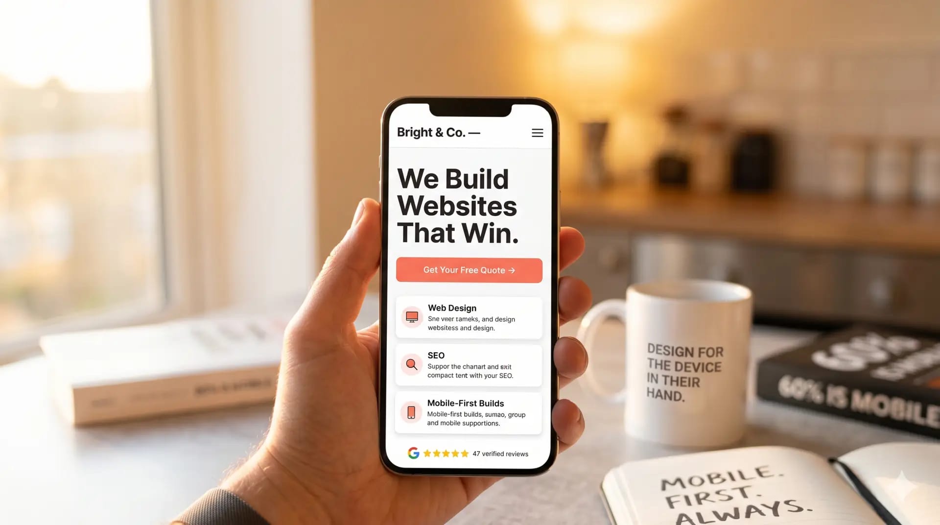
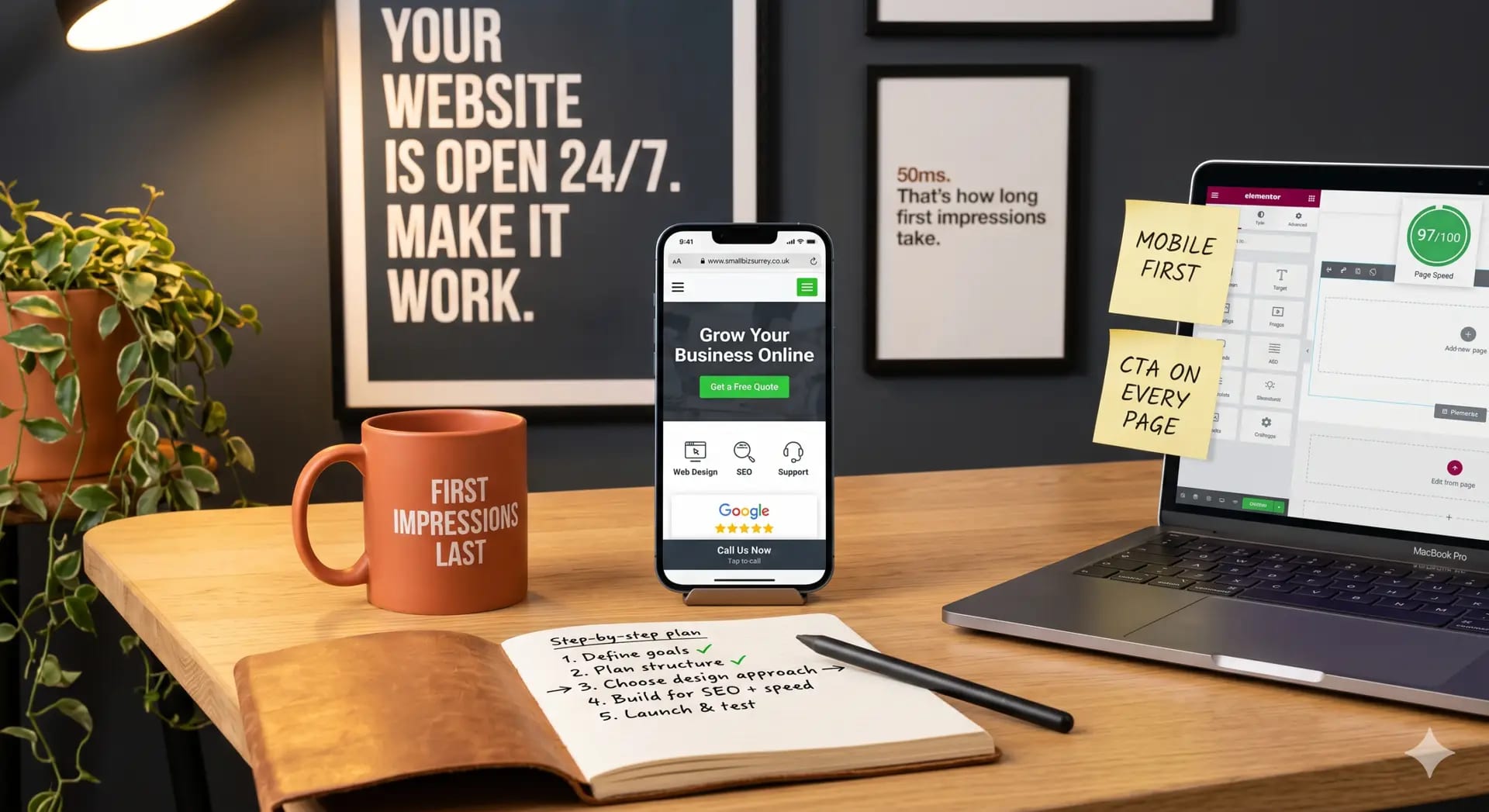
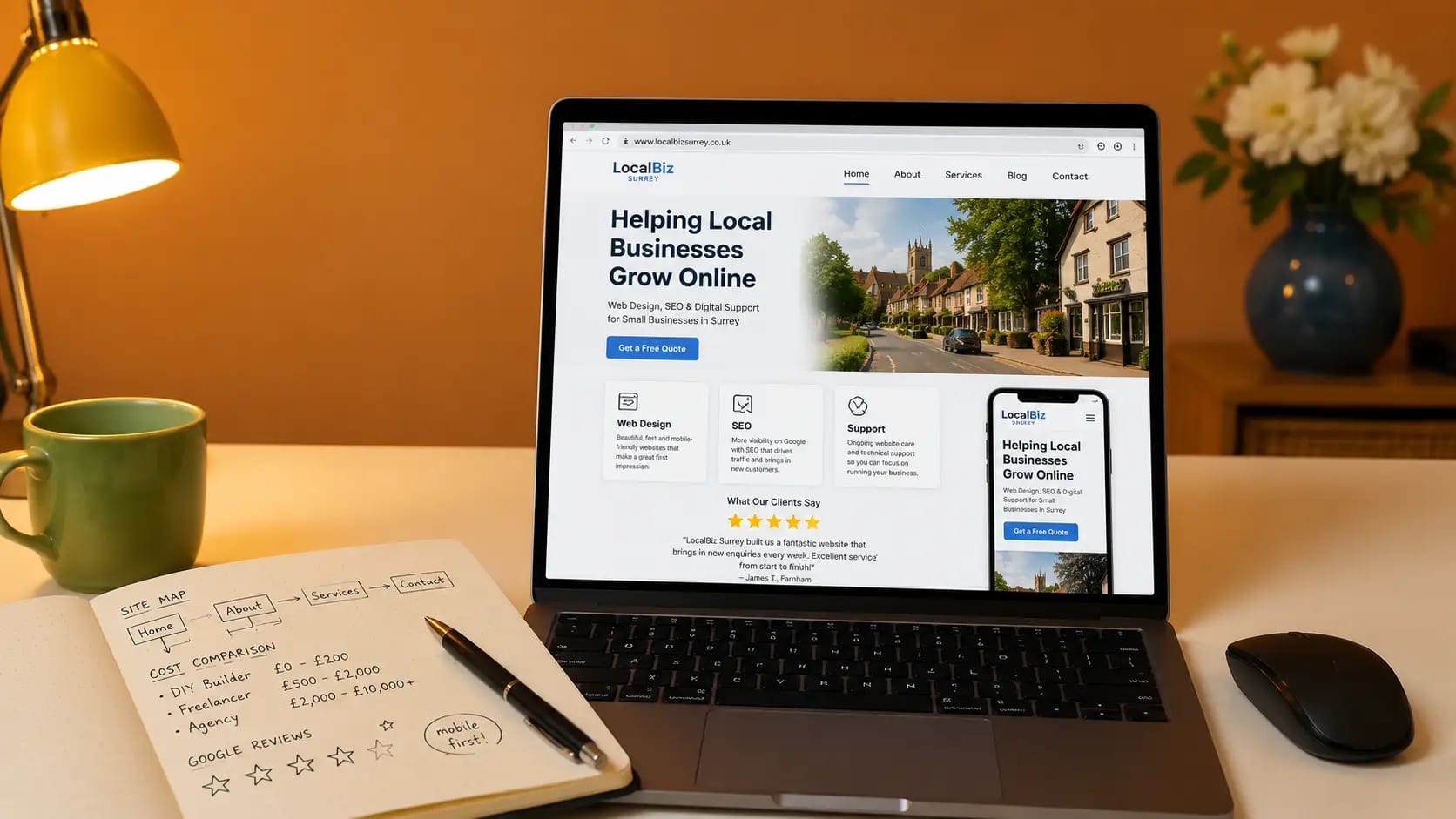
The use of mobile devices is growing astonishingly fast, and in some places it has already overtaken traditional desktop/laptop access to the internet. Unfortunately much of the web isn’t optimized for those mobile devices – it is not mobile responsive. Mobile devices are a different display size to laptops and desktops, and so a different approach to how content is laid out on the screen is required.
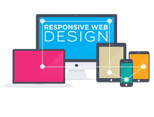
What is Responsive Web Design?
Responsive web design (RWD) is an approach to web design which makes web pages render well on a variety of devices and window or screen sizes.
A site designed with Responsive Web Design adapts the layout of the page to the viewing environment by using fluid, proportion-based grids, and flexible image sizes. It rresponds to the needs of the users and the devices they’re using. The layout changes based on the size and capabilities of the device. For example, on a laptop users might see three columns of text, a tablet might show the same content in two columns, and on a phone users would see content shown in a single column.
- The fluid grid concept calls for page element sizing to be in relative units like percentages, rather than absolute units like pixels or points.
- Flexible images are also sized in relative units, so as to prevent them from displaying outside their containing element.
- Media queries allow the page to use different CSS style rules based on characteristics of the device the site is being displayed on, most commonly the width of the browser.
Responsive web design has become more important as the amount of mobile traffic now accounts for more than half of total internet traffic. Therefore, Google announced Mobilegeddon in 2015, and started to boost the ratings of sites that are mobile friendly if the search was made from a mobile device. All websites designed by Three Girls Media are mobile responsive and are designed using the principle of Responsive Web Design.